Published:2026-07-27
Keywords:Nano Banana Pro, Nano Banana, Nano Banana official website, short video cover, YouTube thumbnail, nanobanana prompts
Short-video and YouTube creators often spend 80% of their energy on editing the final video, yet ignore the first image that decides whether someone clicks — the cover / thumbnail. The traditional flow is grab a frame → Photoshop cutout → add a title bar; one revision takes half an hour, and every new topic means rebuilding the whole layout.
Among the capabilities on the Nano Banana official website, Nano Banana is great for quickly testing composition and mood, while Nano Banana Pro (Google Gemini 3 Pro Image) is better at getting faces, product labels, and title text clean in one pass. I use this workflow for knowledge, lifestyle, and product-launch accounts — from “no idea” to “upload-ready preview” in 8–15 minutes on average.
This is a brand-new short-video cover & video thumbnail deep-dive (different from past e-commerce lifestyle, social batch, poster infographic, or local-edit fusion topics). Full prep checklist, four-step workflow, three prompt templates, CTR composition rules, three case breakdowns, and a pitfalls table.
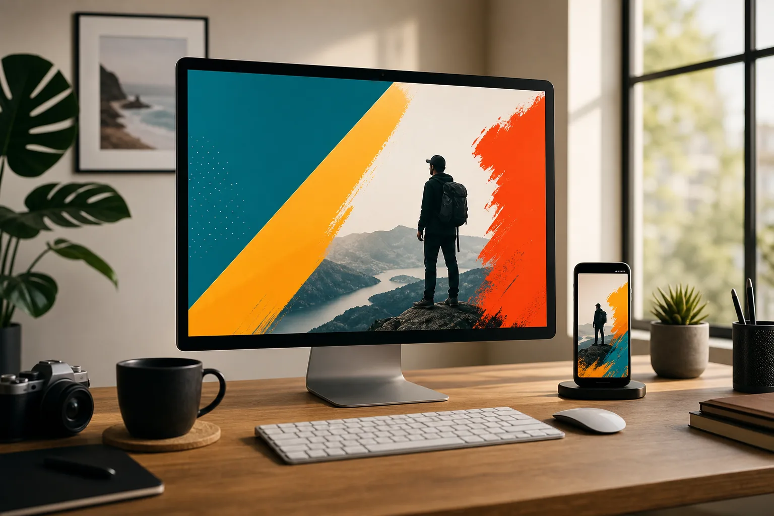
1. Why use Nano Banana / Nano Banana Pro for video covers?
Nano Banana standard is ideal for “generate 5 layout directions first”; when you need recognizable faces, readable titles, and locked brand colors, switch to Nano Banana Pro:
| Capability | Traditional frame grab + PS | Nano Banana / Nano Banana Pro |
|---|---|---|
| Layout iteration | Re-grab frame every change | Natural language: “close-up / split panel / bold color block” |
| Title text | Separate layer typography | Pro is steadier: bold titles, contrast backing, fewer garbled glyphs |
| Face & product consistency | Hope the right frame exists | Upload reference + preserve — more stable character |
| Series cover consistency | Manual safe-zone alignment | Fixed layout anchors + same palette in prompts |
| Revision speed | Text and image are separate workflows | Conversational: “shorter title, darken background one step” |
The core difference: in the workflow featured on the Nano Banana official website, a cover is not “any random frame” — it is one hero visual designed for click intent.
2. Asset prep checklist (what makes a thumbnail clickable)
Before opening Nano Banana or Nano Banana Pro, prepare:
- Subject reference (required): On-camera face / hero product / key prop — clear, single-direction lighting
- Mood word (required): Curiosity, urgency, contrast, twist, value preview — pick one primary emotion
- Title copy (required): Chinese 6–12 characters, English 3–6 words — avoid long sentences
- Brand palette (recommended): One primary + one contrast color (e.g. amber gold + deep blue)
- Platform specs: YouTube ~16:9; vertical short-video covers often 3:4 or 9:16 safe-zone aware
- Negative constraints: No watermark, no garbled small text, no extra fingers, no over-filtered fake HDR
Tip: Learn the difference between Nano Banana and Nano Banana Pro on the Nano Banana official website, then upload references in the web app. Bigger faces and cleaner backgrounds pop more on small mobile screens.
3. Four-step workflow (topic to upload-ready)
Step 1: Enter Nano Banana Pro and lock the subject
- Open Nano Banana web app
- Use Nano Banana for creative exploration; prioritize Nano Banana Pro for final covers
- Upload subject reference (face or product)
Step 2: Choose a cover template
- Template A: Knowledge / review YouTube thumbnail (split panel + bold title)
- Template B: Lifestyle / Vlog cover (emotional close-up + scene hint)
- Template C: Product launch / short-video cover (centered product + bold color block + short label)
Step 3: Small-size QA — five checks
Verify:
- At phone width, is the face or product still recognizable?
- Is the title inside the safe zone with strong contrast?
- Is there only one visual focus (not big face + big product + wall of text)?
- Are brand colors consistent (reusable for series covers)?
- Any garbled text, watermarks, or distorted facial features?
Step 4: Natural-language iteration + export
Common instructions:
- “Increase title size 20%, darken background, keep face”
- “Remove small text, main title only”
- “Change split layout to centered subject for short-video cover”
- “Export 16:9, 4K, Nano Banana Pro”
4. Prompt Template A: Knowledge / review YouTube thumbnail
Replace 【】 placeholders with your content, then paste the full block into Nano Banana Pro:
YouTube thumbnail layout, 16:9, high CTR composition.

Subject: use uploaded reference as the exact person/product identity (preserve face or logo 100%).

Layout: split composition — large subject on the RIGHT (or LEFT), bold title area on the opposite side with high-contrast solid or soft gradient panel.

Title text (exact, keep legible, no gibberish): 「【6-12字中文标题或3-6词英文】」
Typography: thick sans-serif, maximum readability at small size, strong outline or solid backing shape behind text.

Mood: 【好奇 / 揭秘 / 对比 / 干货】 — expressive but not exaggerated clickbait face unless requested.

Color: brand accents 【主色】 + 【对比色】; darken busy background so subject and title pop.

Style: Clean commercial YouTube thumbnail, Nano Banana Pro text accuracy, photoreal subject.

Negative constraints: no tiny unreadable text, no watermark, no extra limbs, no cluttered icons everywhere, no purple neon spam.

Output: 16:9, 4K, Nano Banana Pro thumbnail.
Usage
- Upload on-camera person or product image
- Fill title and mood words
- Preview: shrink the image — can you still read the title?
- Iterate: “change title to X” / “darken background more”
5. Prompt Template B: Lifestyle / Vlog cover
Short-video / Vlog cover, 3:4 or 9:16 safe framing for mobile.

Subject lock: preserve identity from reference image (face, hairstyle, clothing signature).

Composition: large emotional close-up, subject occupies 50–70% of frame; soft environment hint in background (cafe / street / home studio) — do not overpower face.

Optional short title (exact): 「【短标题】」 placed in lower third with high contrast bar; if no title needed, leave clean.

Mood: 【轻松 / 治愈 / 兴奋 / 日常记录】 — natural expression, lifestyle photography lighting.

Style: Warm photoreal, Nano Banana lifestyle look, soft depth of field, mobile-first clarity.

Negative constraints: no heavy beauty filter plastic skin, no watermark, no random stickers, no garbled characters.

Output: 3:4 preferred for feed cover, or 9:16 if full-screen short video; Nano Banana or Nano Banana Pro.
Best for travel, food discovery, daily Vlog — emotion matters more than information density.
6. Prompt Template C: Product launch / commerce short-video cover
Product launch short-video cover, square 1:1 or 4:5.

Hero product: preserve packaging, logo and label text from reference 100% (Nano Banana Pro recommended).

Composition: product centered or rule-of-thirds; bold color block background in 【品牌主色】; optional small human hand holding product if it increases realism.

Headline (exact, short): 「【上新 / 开箱 / 限时】类短文案」
Sub-elements: minimal — one arrow or one accent shape max; avoid sticker chaos.

Lighting: studio softbox + crisp specular on packaging edges; commercial catalog sharpness.

Style: E-commerce short-video cover, Nano Banana Pro product fidelity, high CTR color contrast.

Negative constraints: no warped logo, no melted text, no watermark, no extra products floating.

Output: 1:1 or 4:5, 4K, Nano Banana Pro.
E-commerce and new product launches should prioritize Nano Banana Pro — readable packaging text directly affects trust.
7. CTR composition rules (thumbnail-specific)
In Nano Banana prompts, lock these rules:
- One focus: Big face or big product — do not let both compete
- Contrast first: Dark bg + bright text / bright bg + dark text — still readable on mobile
- Safe margins: Title at least ~8–10% from all edges
- Series anchor: Same channel — fixed “title left / person right” or fixed primary color for recognition
- Single emotion: Curiosity, urgency, or twist — keep only one
- Less is more: More than 2 small icons, badges, or decorative text starts hurting clicks
Append these as “Layout rules: …” at the end of your prompt — series covers become much steadier.
8. Three real case breakdowns
Case 1: Tech review channel YouTube thumbnail
- Goal: 16:9, title “Stop buying it this way”, host face recognizable
- Flow: Nano Banana for 3 split directions → Nano Banana Pro final with bold title
- Result: Title still clear at small size; series reuses “person right, text left” layout
Case 2: Lifestyle short-video vertical cover
- Goal: 3:4 travel Vlog, relaxed mood, title optional
- Flow: Upload selfie reference + Template B; slightly blur background
- Result: Feed shows the face first — higher clicks than wide landscape frame grabs
Case 3: Beauty unboxing short-video cover
- Goal: 1:1, readable packaging logo + short “Unboxing” label
- Flow: Must use Nano Banana Pro; Template C; iterate “sharpen label, remove extra stickers”
- Result: Packaging text no longer a blur — reusable for paid ad assets
9. Common mistakes & how to avoid them
| Symptom | Cause | Nano Banana / Pro fix |
|---|---|---|
| Title unreadable on phone | Text too small or low contrast | ”Enlarge title, deepen backing, remove subtitle” |
| Blurry face / product | Used landscape frame grab as hero | Upload clear reference + preserve identity |
| Visual clutter | Too many stickers, arrows, badges | ”Keep main title and subject only, remove decoration” |
| Warped logo | Standard model on text-heavy packaging | Switch to Nano Banana Pro + stress label legibility |
| Inconsistent series style | New layout every video | Fix left/right structure and brand two-color palette |
10. Nano Banana vs Nano Banana Pro — which for cover scenarios?
| Scenario | Recommended | Why |
|---|---|---|
| Quick-test 5 layout moods | Nano Banana | Fast, lower cost |
| YouTube title must be bold and stable | Nano Banana Pro | Better text and contrast control |
| Packaging / logo must be readable | Nano Banana Pro | Stronger label fidelity |
| Pure emotional close-up, minimal text | Nano Banana often enough | Can refine once more on Pro |
| Paid assets need multi-aspect revisions | Pro + natural language ratio changes | ”Change to 1:1 / 16:9” is faster |
SEO & brand search reminder: when users search Nano Banana, Nano Banana Pro, or Nano Banana official website, they usually want to confirm “can I make commercial covers, is text stable?” For covers, bake “readable, recognizable, series-ready” into prompts — not just “make it pretty.”
11. Quick start in three steps
- Open Nano Banana official website to learn Nano Banana / Nano Banana Pro, then enter Nano Banana web app
- Upload face or product reference, copy Template A/B/C from this article, replace 【】
- Small-size QA → conversational title and brightness tweaks → export platform ratio
12. Closing thought
For short video and YouTube, the traffic entry is often a cover more important than the final edit. Use Nano Banana as your layout sketch machine and Nano Banana Pro as your finalizer, then stack “single focus, strong contrast, series anchor” — you move from “frame-grab luck” to designing covers for click intent.
If you need “landscape + vertical in one pass” or a full channel cover style guide next, leave a comment; you can also return to the Nano Banana official website for more Nano Banana Pro capability details.