Published:2026-07-21
Keywords:Nano Banana Pro, infographic, poster layout, nanobanana prompts, text rendering, Nano Banana official website
When making event posters, knowledge cards, or data infographics, two failures hurt most: titles melting into garbled glyphs, and unclear information hierarchy. Many people generate art in Photoshop then overlay type — long pipelines, many versions, and brand colors that drift.
After I locked a “define text structure first, then let the model render” workflow, Nano Banana Pro (Google Gemini 3 Pro Image) clearly raised CN/EN title readability for posters and infographics, and pairs well with Nano Banana standard: explore composition fast on standard, finalize 4K on Pro. You can also learn product capabilities on the Nano Banana official website, then jump into the web app to generate.
This is a brand-new infographic & poster text layout deep-dive (different from past e-commerce product shots, social batch, portrait fashion, or character turnaround topics). Full prep checklist, four-step workflow, three copy-ready prompts, layout tips, three cases, and a pitfalls table.
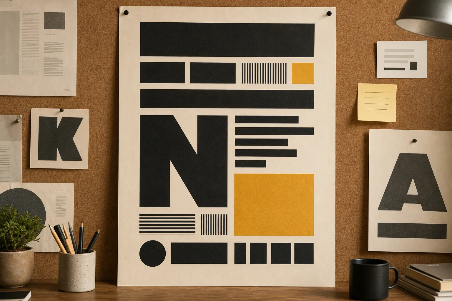
1. Why Nano Banana Pro for posters and infographics?
Nano Banana standard is great for quick composition brainstorms; when you need readable titles, sharp numbers, and stable brand color, Nano Banana Pro is the better fit:
| Capability | Traditional “draw first, typeset later” | Nano Banana Pro text-in-image |
|---|---|---|
| CN/EN title readability | Depends on later fonts | Pro text rendering accuracy is high — ideal for cover titles |
| Information hierarchy | Manual layer alignment | Specify H1 / H2 / data-block positions in the prompt |
| Brand color consistency | Eyedropper every revision | Write HEX palette into every prompt |
| Revision speed | Retype means full re-layout | Natural language: “shorten title to ≤8 characters” |
| Output specs | Re-export every size | Describe 1:1 / 4:5 / 16:9 once |
In short: Nano Banana Pro behaves more like a design assistant that understands layout briefs — you spell out titles, subtitles, data points, and safe zones; it renders structure, instead of randomly “painting.”
2. Pre-generation checklist (what decides clean text)
Before opening Nano Banana or Nano Banana Pro, prepare:
- Final copy (required): Main title ≤12 characters, subtitle ≤20 characters, at most 3–5 data points (more words → more blur risk)
- Brand palette (required): Primary, secondary, background — one HEX each
- Style anchor (Image 1, optional): One finished poster/infographic you trust to lock mood
- Icon/illustration style: Flat / semi-real / minimal line — write it into the prompt
- Output specs: Event poster 3:4, knowledge card 1:1, banner 16:9
- Negative constraints: No garbled text, no extra microcopy, no watermark, no competitor logos
Tip: On the Nano Banana official website or in the app, structure copy as “main title / subtitle / bullet list” before generating. Controlling length matters more than stacking adjectives.
3. Four-step workflow (from copy to 4K poster)
Step 1: Enter Nano Banana Pro
- Open Nano Banana web app
- Select the Nano Banana Pro model
- If you have a style anchor, upload it as Image 1
Step 2: Choose a template type
- Template A: Event / course poster (strong title + hero visual)
- Template B: Knowledge card / tips graphic (clear bullet list)
- Template C: Data infographic (big numbers, clean chart area)
Step 3: Generate preview and do a “text QA”
Check carefully:
- Main title fully readable, no missing strokes or garbled glyphs
- Numbers and percentages correct, no misalignment
- Hierarchy clear (title > subtitle > body bullets)
- Safe margins on all sides (avoid platform crop)
Step 4: Natural-language revisions + 4K export
Common tweaks:
- “Shorten main title to 10 characters, larger type size”
- “Move subtitle lower; data block to three columns”
- “Reduce background noise; primary color to #F59E0B”
When satisfied, request 4K output for print preview, social posting, or website banners.
4. Prompt Template A: Event / course poster (copy-ready)
Best for: Public workshops, product launches, offline event teasers
How to use: Replace【活动主题】and【日期地点】with your real copy.
Brand lock: Primary #F59E0B, secondary #6366F1, background clean #FAFAFA. Modern sans-serif title mood matching Nano Banana brand.

Subject: Event poster for 【活动主题】 — premium workshop promo for Nano Banana Pro users.

Typography hierarchy (MUST be readable):
1) Main title: short Chinese headline, max 12 characters, bold, top-center or top-left
2) Subtitle: 【日期地点】, smaller, high contrast
3) CTA strip: "了解更多 · Nano Banana 官网" style area, clean, no garbled glyphs

Visual: Hero illustration or product mood on right/lower third, generous whitespace, flat + subtle photoreal blend.

Layout: 3:4 portrait poster, 8% safe margin on all sides, no overlapping text on busy texture.

Negative constraints: no illegible microtext, no random English gibberish, no watermark, no extra logos.

Output: 3:4, 4K, Nano Banana Pro sharp text rendering.
Usage notes
- Paste the template in Nano Banana Pro; replace theme and date/location
- First generate a 1K preview; zoom to inspect title strokes
- Only output 4K after confirmation
5. Prompt Template B: Knowledge card / tips graphic (copy-ready)
Best for: Xiaohongshu tips, newsletter art, tutorial cover inners
Highlights: Clear lists — ideal for 3–5 bullet points.
Brand lock: Follow Image 1 style if provided; else use Nano Banana clean editorial look — #F59E0B accents on white/off-white.

Subject: Educational knowledge card about 【知识点标题】 for Nano Banana / Nano Banana Pro beginners.

Typography hierarchy:
1) Title: max 14 characters, bold, top
2) Numbered list: 4 bullet points, each max 16 characters, large readable type
3) Footer: small brand line "Nano Banana 官网 · 实用技巧" — legible

Layout: 1:1 square, card-like rounded frame optional, clear left-aligned list, icons simple and consistent.

Negative constraints: no dense paragraphs, no tiny footnotes, no garbled CJK, no watermark.

Output: 1:1 (1080x1080 master upscaled to 4K), Nano Banana Pro crisp glyphs.
6. Prompt Template C: Data infographic (copy-ready)
Best for: Comparison tables, process steps, conversion funnel sketches
Highlights: Biggest numbers, clean chart regions.
Brand lock: Corporate-clean Nano Banana Pro aesthetic, primary #F59E0B, charts in #6366F1 / soft gray.

Subject: Infographic explaining 【数据主题】 — 3 KPI callouts + one simple process flow for AI image workflow with Nano Banana.

Typography & data (MUST be correct and sharp):
1) Headline max 12 characters
2) Three big numbers with short labels (e.g. "15分钟", "4K", "95%")
3) Process steps 1-2-3 with short verbs, no paragraphs

Layout: 16:9 or 4:5, grid aligned, ample spacing between blocks, no decorative noise behind numbers.

Negative constraints: no fake unreadable axis labels, no melted digits, no watermark, no clutter.

Output: 16:9 banner or 4:5 social, 4K, Nano Banana Pro precise text.
7. Type hierarchy & safe-zone tips (Nano Banana Pro advanced)
Infographics usually fail not because “the art is not flashy enough,” but because type has no hierarchy and margins are too tight. Five practical rules:
- Set character limits first: Main title ≤12 characters beats “bigger is better”
- Spell out H1 / H2 / data blocks: Number them in the prompt so Pro can follow
- Write safe margins as percentages: e.g.
8% safe marginto avoid platform crop - Less is more: At most 5 information points per image
- Revise text instructions only: Once composition is good, change titles via chat — do not rewrite the whole style block
8. Three real case breakdowns
Case 1: Nano Banana official website event poster
- Input: Theme “Pro workflow open class” + date/location
- Template: Template A
- Result: Clear Chinese main title, brand-orange accents, 3:4 for social ads
- Use: Website event banner derivatives, community share graphics
Case 2: Beginner knowledge card
- Input: 4 “how to use Nano Banana” tips
- Template: Template B
- Result: Readable 1:1 card list — good for Day1–Day7 series
- Use: Xiaohongshu, WeChat communities
Case 3: Workflow efficiency infographic
- Input: Three KPIs (15 min, 4K, batch)
- Template: Template C
- Result: Sharp numbers, clear steps 1-2-3
- Use: LinkedIn / official website blog art
9. Common mistakes & how to avoid them
| Symptom | Cause | Fix |
|---|---|---|
| Garbled or missing title strokes | Too many characters / no “readable” emphasis | Limit length + sharp text rendering |
| Numbers melt together | Type too small, busy background | Big numbers + clean background blocks |
| Information wall | More than 5 bullets | Split into a multi-card series |
| Platform crops off text | No safe zone | Specify margin / safe zone |
| Brand color drift | No HEX written | Copy palette paragraph into every prompt |
10. Nano Banana standard vs Nano Banana Pro — which to choose?
- Nano Banana (standard): Composition tests, palette experiments, internal brainstorm drafts
- Nano Banana Pro: Titled posters, infographic finals, commercial output that needs 4K and readable text
Suggested path: explore layout on standard → finalize type on Nano Banana Pro. Product intro and entry points are on the Nano Banana official website.
11. Quick start in three steps
- Finalize three-layer copy → open Nano Banana Pro
- Copy the matching template → replace theme / bullets / data → 1K preview text QA
- Tune hierarchy & margins → 4K export and publish
12. Final thought
Posters and infographics win not on “how fancy the background is,” but on readable at a glance, recognizable brand, trustworthy numbers. Nano Banana Pro pulls “illustration” and “layout” into one natural-language workflow — you define hierarchy; it renders.
If you still “generate blank art then PS overlay type,” try Template B today for a 4-bullet knowledge card. In about fifteen minutes you may rethink the efficient creation the Nano Banana official website emphasizes: fewer revisions, more finals.